Google Prepares Major Android UI Overhaul with Material 3 Expressive Design
Google is set to introduce significant visual changes to Android's user interface, incorporating extensive blur effects and redesigned elements as part of its new Material 3 Expressive theme. The upcoming overhaul, discovered in Android 16 Beta 4, signals the platform's most substantial design refresh in recent years, representing a strategic shift in mobile interface design innovation.
The redesign aims to modernize Android's appearance while improving functionality across key system interfaces. Though not yet enabled in the current beta, these changes could roll out in future quarterly updates, following a pattern similar to previous successful digital transformation implementations.
Design Evolution and Core Improvements
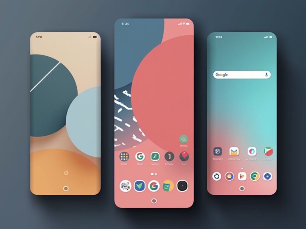
The new interface introduces blur effects throughout the system, most notably in the Quick Settings panel and app drawer. This marks a departure from Android's traditional solid backgrounds, creating a more contemporary aesthetic similar to other mobile operating systems. According to Google's Material Design documentation, these changes prioritize user experience and visual hierarchy.
Status bar elements receive a notable refresh, featuring segmented WiFi and mobile data icons, along with a more expressive battery indicator that displays green while charging and red when low. The system font has been enhanced for better readability, particularly in the clock display.
The Quick Settings and notification panel maintains its combined layout but adds new features like resizable tiles and one-click toggles. The lock screen sees a cleaner reorganization, with improved placement of date, weather, and contextual information.
Enhanced Functionality and User Experience
The volume and media controls undergo significant refinement, replacing the current thick, pill-shaped sliders with sleeker designs featuring distinct handles. The Settings app receives a comprehensive overhaul, bringing back colorful icons and introducing card-based menu items for improved navigation, demonstrating how modern workplace technology evolution influences mobile interfaces.
Customization and Personalization Features
New customization options allow users to choose from five unique icon shapes, including "square," "four-sided cookie," and "complex clover," offering greater personalization possibilities. These options extend beyond mere aesthetics, providing functional benefits for users with different visual preferences and accessibility needs.
Implementation Timeline and User Response
The final timeline for these changes remains uncertain, with more details expected at Google's upcoming I/O developer conference. Early user polling shows mixed reactions, with 34% expressing enthusiasm for the refresh, while 19% prefer the current design. This feedback will likely influence further refinements before the final release.
The transition represents a significant step forward in mobile interface design, balancing aesthetic improvements with practical functionality enhancements that benefit both casual and power users.